Our journey to take Qwilr’s editor to the next level continues!
And we’re pretty stoked about our latest releases.
We’ve introduced new layout capabilities, made reworking your content more intuitive and made further improvements to how quickly and easily you can create outstanding proposals in Qwilr.
Lay out your offer, your way
Qwilr customers have long been able to divide their content into 2 columns, allowing them to cleanly present copy, images, videos, and more alongside one another.
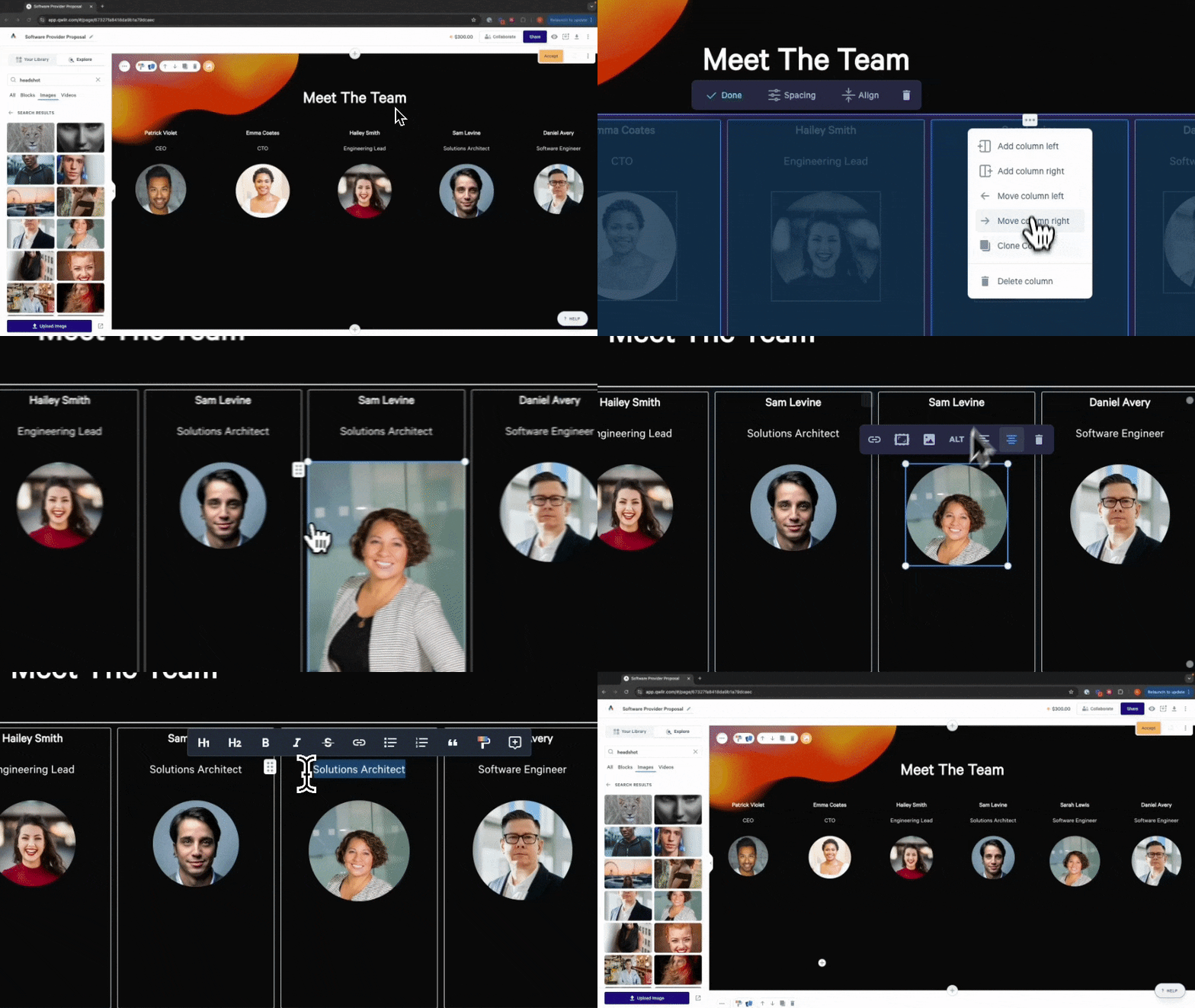
Now, we’re taking this a step further! With our new Layout widget, you can choose to add content to your Qwilr page in two, three, four and up to 12 columns.

The Layout widget will be replacing our 2 Column widget, but you’ll still be able to add all the same amazing types of content into your enhanced designs. You’ll just have a lot more freedom in how you can structure your offer.
For example, you can now showcase your services across six columns, highlight client case studies alongside testimonials over four columns, and present key features of your services or product in a manner that’s easy for your buyers to digest.
You can now get even more creative with your designs and present your prospects with an impressive offer that is sure to help you outshine the competition.
Since the Layout widget is taking over from the 2 Column widget, all the 2 Columns in your existing pages will become Layouts.
You shouldn't see any issues here, but we'd still recommend reviewing any former 2 Column widgets in pages you're editing – as the content may not look exactly the same.
Introducing drag handles
Creating collateral using traditional tools can be a real drag.
With our new drag handles, however, producing powerful proposals is a breeze!
Simply grab the handle icon, next to any piece of content, and effortlessly move it to your desired location.
Whether you’re repositioning images, moving text blocks or adjusting entire sections, these drag handles make it easy to design proposals that stand out.

We’re committed to making the design process as easy as possible, while giving you a ton of flexibility at the same time.
It’s truly never been easier to rework and redesign your proposals, allowing you to refine your content and ensure that everything is perfectly placed.
Streamlining content selection
We’ve also made improvements to how you select content on your pages. Selecting content, across different parts of each block, is now much more intuitive – again, making it easier for you to craft your masterpiece.
Lastly, you can also say goodbye to unwanted blank spaces.
In the past, Qwilr pages would sometimes end up with a pesky line of whitespace at the bottom of some blocks.
Well, those days are behind us and you can now simply delete these lines, and keep your page looking exactly the way you want.
No more scrolling forever for your buyer.
And there’s more to come
We’ve still got plenty of tricks up our sleeve when it comes to our editor.
We’re on a mission to make it as easy as possible for you to pull together powerful proposals, equipping you with the tools you need to get as creative as you can with our custom layouts and dynamic content.
We’re continually working on ways to level up our editor and we can’t wait to share what’s next!
About the author

Guy Hall|Product Marketing Manager at Qwilr
Guy works on product marketing at Qwilr – tackling things like positioning, messaging, sales enablement and more. Guy has a background in content and communications, and has worked across a variety of industries including tourism, telecoms and tech.