With our newest feature update, you can add a confirmation page or thank you page after a deal is accepted, redirecting your buyer to the appropriate next step.
A confirmation page is an incredibly effective tool for guiding buyers on the next steps and keeping the momentum going once a deal is accepted. Let’s explore why they’re a useful addition to your sales proposal.
Leveraging a confirmation page in sales
When a prospect finally signs the deal, it’s important to keep the excitement and momentum going. But once a deal is signed and closed, reps usually resort to a manual follow-up process by sending a buyer emails with documents, onboarding checklists, and endless PDFs attached. The result? Buyers get overwhelmed with the volume of messages they have to open and act on.
But what if you could do that in fewer steps and automatically?
That’s what a confirmation page (or thank you page) is all about— providing an organized flow of next steps based on the action just taken. Now you can add confirmation and thank you pages in your Qwilr proposal— it’s our newest product release and we couldn’t be more excited over the possibilities.
Here are 4 ways to use a confirmation page in your sales collateral:
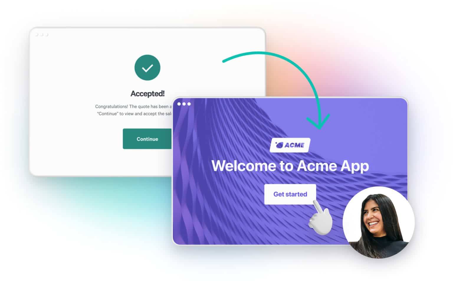
1. Direct buyers to an onboarding page
After a deal is accepted, get the ball rolling to show the value of your product or service. Using the redirect feature, you can set up an onboarding page personalized to the customer, and easily hand them over to customer success or an account manager with clear next steps outlined. Add in a calendar link to book a training session, self-serve links to get started, or even a “get to know your account manager” section.
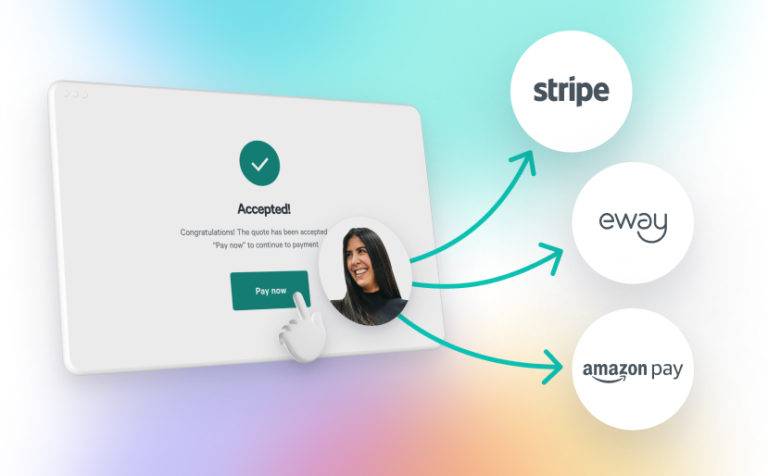
2. Direct buyers to a payment page
If you’re not using Qwilr’s integration with Stripe, you can still collect payment after a deal is accepted by redirecting customers to your own payment page. What better way to collect a deposit or payment in full without any extra steps for you or your new customer?
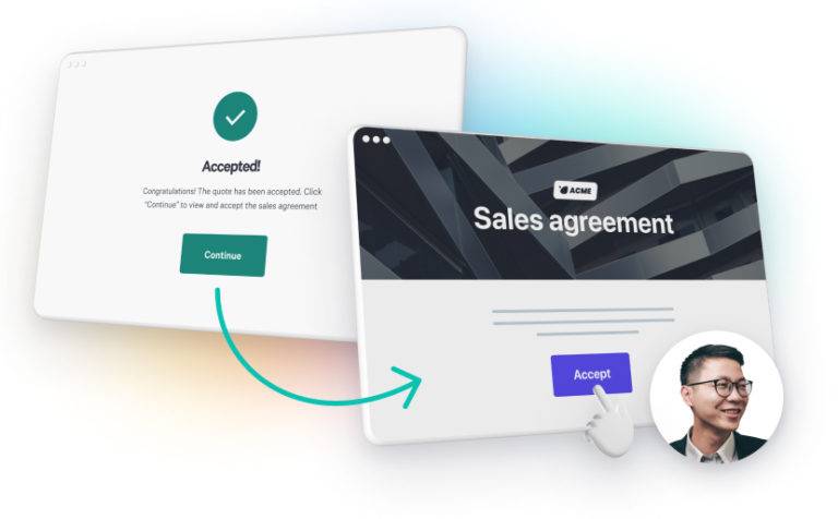
3. Direct buyers to a second Qwilr page they need to read and accept
If your service or product is more complex and additional terms need to be accepted, redirect customers to a second Qwilr page that is purely designed to be a legal contract. So easy to do, and you’ll make your legal team happy, too.
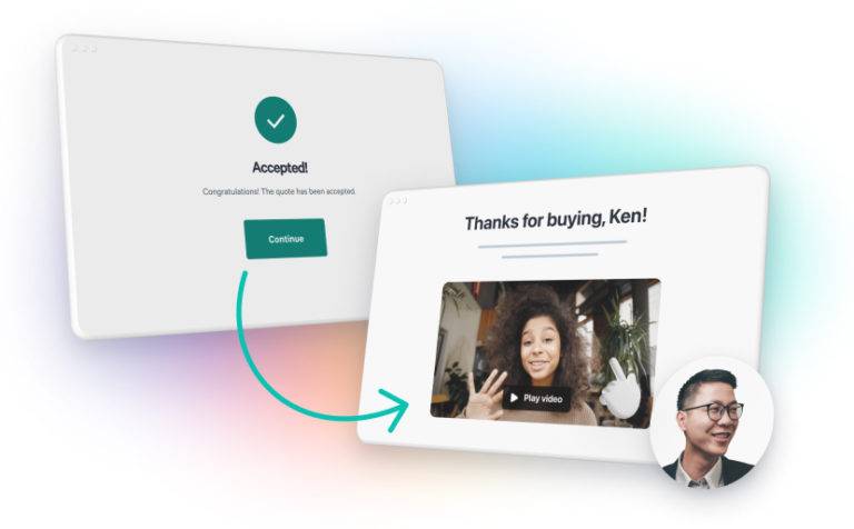
4. Create a personalized thank you page with a video
Making a customer feel welcome and valued is a core part of creating a superior buyer experience. With this new feature, you can redirect customers to a personalized thank you page, and create a personal welcome with our video embed feature. As an example, here at Qwilr, we're obsessed with using Loom to create welcome videos for our own customers.
Confirmation page for the win
Qwilr’s aim is to give sales teams a tool to provide a superior buyer experience by creating a digital home Qwilr’s mission is to give sales teams the tools they need to provide a superior buyer experience and advance the conversation between buyers and sellers. Our new confirmation page ability keeps the momentum going, and directs customers in the next step of their journey - try it now.
Visit our documentation for extra information.
About the author

Tania Clarke|Head of Product Marketing
Tania heads up product marketing at Qwilr – looking after positioning, sales enablement, competitor intelligence and more. Tania brings experience from former roles at high growth startups like Atlassian and Safety Culture.
