I still remember my first sales role, racing to hit quota and sending proposals that were more functional than formal. No one cared about polish; the only thing that mattered was whether it helped close the deal.
Years later, I found myself in marketing. Suddenly, I was in a different world — obsessing over margins, fonts, and layouts with designers who treated every proposal like a brand campaign, where we cared excessively about how it looked more than how it was converted.
Having lived in both camps, what I now know is that somewhere between sales urgency and marketing perfection, most proposals lose their power. They look great but stall. They’re static, buried in inboxes, full of effort but light on action.
My learning? A modern proposal should do more than impress. It should move, guide, engage, and convert.
If you’re tired of sending proposals that go quiet, this article is for you. These 13 business proposal ideas will help you create proposals that not only look good but actually get a “yes.”
Let’s dive in.
Start with the basics (but make them better)
When building a proposal, it’s tempting to jump straight to the impressive elements — the slick design, the clever embeds, the differentiators that make you stand out (been there), and those things do matter — but only if the foundation is solid.
The truth is, deals often fall apart before the buyer even gets to that part. It’s the basics — your introduction, your proof, your pricing — that either build trust or quietly erode it. Nail those first, and everything else you’ve added will work harder to move the deal forward.
1. Personalize your intro to reflect real buyer pain
Most proposals open with something forgettable — a one-liner like “We’re excited to present our solution” or “This proposal outlines how we can help.” While it’s well-meaning, it says nothing. For a stakeholder who’s skimming between back-to-back meetings, with five other tabs open and internal pressure to move quickly, those kinds of openers waste their attention.
What they’re really scanning for is this: Do you get what we’re dealing with?
Something like “As you prepare to onboard 500 new users ahead of Q4 and move off your legacy system, this proposal focuses on reducing implementation time without adding to internal overhead” lands differently. It shows you’ve listened, and it tells them they are partnering with the right team.
2. Tailor testimonials to their industry or use case
Where most proposals miss the mark is burying the testimonial at the very end — or worse, choosing something so generic it could’ve come from any client, anywhere. But when a buyer sees someone just like them — facing the same challenge, in the same industry, with the same constraints — it doesn’t just build credibility. It helps them picture themselves saying yes.
So instead of ending with a vague “They were great to work with,” we suggest placing a sharp, relevant quote exactly where the hesitation might show up. For example: “Rolling out the integration took under 10 days, and we saw adoption across our entire sales team within the first week.” — Head of RevOps, B2B SaaS
If you're using a sales proposal template, insert a quote like this directly below your onboarding plan or feature rollout section. It will not just reassure your prospect, but will also confirm that you're speaking from experience, not theory.
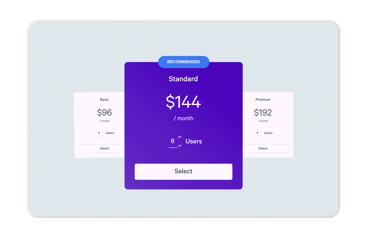
3. Use interactive pricing tables that adjust to the prospect’s needs
One of the fastest ways to stall momentum is to resend the proposal. Maybe the client wants to remove a line item, split the project into phases, or see what a shorter commitment looks like — and suddenly, you’re juggling multiple versions and buried email threads.
No one wants to dig through three attachments to find the “right” version. From a sales representative’s perspective, that kind of admin eats into valuable time and slows down the close.
Interactive pricing changes that. It lets your team make real-time edits that update instantly, so the proposal always reflects the most current conversation, without needing to generate a new doc each time.
If you’re using a tool like Qwilr, that flexibility is built in. As Robert Brooks, VP of Sales at Lambda and a Qwilr user, put it:
“It’s been really helpful to be able to make changes on the fly and not have to resend a bunch of documents. It’s a much better customer experience than someone needing to look through multiple versions to find the most current one.”
4. Enable live proposal tracking
You know it better than anyone — one of the hardest parts of sales is the silence that follows after a proposal goes out. Did they open it? Forward it? Get stuck on pricing? Or did it die in the CFO’s inbox without a chance?Live tracking takes the guesswork out, allowing you to see when a proposal’s been opened, how long they spent on key sections, and whether it’s been viewed by more than one person, so you’re not reaching out blind.
Here’s what it looks like in action:
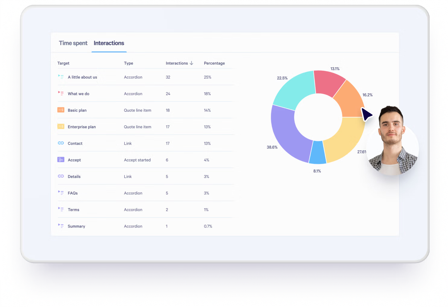
If the prospect spent five minutes re-reading your pricing page but skipped the timeline, that’s a different conversation than someone who clicked through once and bounced in under 30 seconds.
At Qwilr, this functionality comes built-in. That way, you’re not left wondering what happened after you hit send. You have the context to follow up at the right time, with the right message, and keep the deal moving.
Strategically align with your buyer’s decision-making
Once the basics are solid, it’s time to move beyond presentation and start thinking about decision flow. The following ideas are about reducing hesitation, supporting internal conversations, and helping your buyer get to “yes” with less resistance.
5. Embed an ROI calculator that shows value instantly
No one buys just because something sounds good; what also matters are the numbers! Especially when your buyer needs to take your proposal further up the chain, they need something tangible to justify the spend.
An ROI calculator helps you do exactly that. Whether it’s time saved, revenue unlocked, or churn reduced, showing the upside in real terms turns your proposal into a business case, not just a line item.
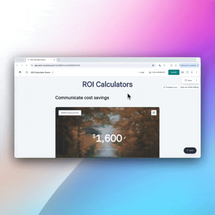
When using Qwilr, our customers have been able to embed a simple ROI calculator that surfaces the most compelling figures early. It gives buyers something they can share, build a case around, and come back to — even if you’re not in the room to pitch it yourself.
6. Structure content by deal stage or stakeholder priority
Most proposals are written as if they’ll be read by one person. But in reality, they’re often passed around — to a CFO, a legal team, an operational lead — none of whom were on your original call, but all of whom now influence the outcome. According to Gartner, B2B buyers spend only 17% of their buying journey meeting with suppliers. The rest? They’re researching independently or aligning internally, without you in the room to explain, clarify, or pitch.
That’s why proposal structure matters so much. When you build modularly, starting with the problem, layering in proof, then pricing, you make it easier for buyers to guide themselves. And when you segment sections based on stakeholder priorities (think: a “Why this matters for your team” block vs a “What finance needs to know” breakdown), you reduce confusion and support those internal conversations.
7. Include objection-handling blocks inside the proposal
Every proposal carries silent friction — the questions your buyer won’t always ask out loud, but that still shapes their decision. What happens if we need to scale? Can we get out of the contract early? Will support actually be responsive? The more of those doubts you surface and resolve in the proposal itself, the less likely they are to stall the deal later.
That’s why objection-handling blocks are so powerful. Collapsible FAQs, “You might be wondering…” sections, or side-by-side comparisons let you proactively address the concerns that usually emerge during follow-up calls, especially around pricing, compliance, support, or timelines.
But here’s where many companies go wrong: they treat FAQs like a generic add-on. Same five questions, no matter the buyer, no matter the context. When you tailor those sections based on what’s already come up in the sales process — or what’s likely to come up internally — they stop feeling like filler and start working as reassurance.
It’s not just about being thorough, but reducing hesitation, removing the need for back-channel clarification, and keeping the proposal as the single source of truth all the way through.
8. Guide the next step before they ask
A buyer reviewing your proposal is rarely just thinking, “Should we say yes?” More often, they’re quietly wondering, “What happens next if we do?” That moment — the uncertainty between interest and action — is where many proposals lose momentum.
That might mean including a “milestone timeline” in a consulting scope, or a short “What onboarding looks like” block after pricing. For instance, someone using our digital marketing proposal template might include a section outlining channel strategy breakdown, or what success looks like, or even risks and how they mitigate them.
That kind of clarity doesn’t just inform; it nudges action, and it’s not surprising that when buyers can see what’s coming, they’re more likely to move.
Give prospects a seamless experience by integrating e-signatures and agreements directly into your proposal so that they can sign and accept on the spot.

Add differentiators that do the selling for you
More than three-quarters of the customers Gartner surveyed described their last B2B purchase as very complex or difficult. And when every provider sounds similar, the burden of clarity shifts to your proposal. Saying the right thing often isn’t enough — you need to show it, prove it, and make it feel like the obvious choice.
9. Kick things off with a video walkthrough
Ever sent a proposal and wondered if they’d read it the way you intended, or worse, misunderstood the most important part?
Proposals are often opened in a completely different context from when the conversation took place — passed around internally, skimmed between meetings, and read without your presence. A short, personalised video reintroduces your presence. It helps anchor the narrative, clarify key points, and gently guide the buyer through what they’re seeing — in your words, at their pace.
From a psychological perspective, it reduces uncertainty, builds connection, and keeps momentum alive. With Qwilr, you can embed videos directly into your proposal using an Embed Block, whether it’s from Loom, Vimeo, YouTube, or another platform. Users can embed code, customize the layout, and place the video exactly where it adds the most value, like a walkthrough up top or a quick explainer beside pricing, offering a seamless experience to their prospects.
10. Build proposal-to-payment flows
In the traditional flow, the proposal gets sent… then signed… then the invoice follows… and then maybe, eventually, the payment lands. The longer that window, the more space there is for priorities to shift, internal blockers to pop up, or urgency to fade. And in fast-moving industries, that’s often the difference between closing the deal and chasing it.
The businesses winning today are building a different kind of experience, one where the proposal doesn’t just present the offer, it closes the loop, from A to Z in one place.

If you are a Qwilr user, you can embed secure payment blocks directly inside your proposal using QwilrPay without the need to send a separate invoice or redirect the buyer elsewhere. Prospects can review, approve, and pay, all from the same page. It’s faster, cleaner, and far more aligned with how modern buyers expect to transact.
11. Design for how people actually read
Buyers don’t read proposals like reports; they scan them like websites. They jump to pricing, skip back to proof, skim the timeline, and rarely read word-for-word. Traditional static formats weren’t built for this kind of behaviour, and it shows.
In Qwilr’s recent report, The Death of Static Proposals, we found that:
- 60% of proposal views happen on mobile, where PDFs are clunky and hard to navigate
- Readers often revisit proposals multiple times, jumping between sections non-linearly
- And the longer it takes to find key info, the more likely the deal is to stall
In other words, format isn’t just aesthetic; it affects how (and whether) your message lands.
That’s why proposals designed like landing pages — modular, visual, and built for interaction — perform better. With Qwilr, you can structure content in a way that works with buyer behaviour: collapsible FAQs, scrollable sections, side-by-side pricing, and embedded explainers, which ultimately leads to a smarter way to guide the decision.
12. Let your brand do the talking
Clients overlook clunky fonts, inconsistent colours, or missing logos when you are getting started—they’re buying you, not your brand. But as your business grows, so do expectations, and what I’ve come to realise is this: your proposal often makes the case when you’re not in the room, and that’s where a polished, on-brand proposal does the talking.
It builds familiarity, reinforces trust, and signals that you run a tight ship. From typography to tone to how your pricing tables are styled — these little things stack up.

With Qwilr, teams can apply consistent branding across every proposal using templates, custom themes, and reusable blocks. So even if you’re sending proposals at speed, they still feel cohesive, considered, and unmistakably yours.
13. Highlight scope boundaries clearly
Lastly, misunderstood timelines, blurred responsibilities, or scope assumptions that were never clarified up front can quickly turn a “yes” into tension. That’s why setting clear scope boundaries is crucial, as it shows that you’ve done this before, that you know where things often slip, and that you’re committed to making delivery just as smooth as the sale.
One way to do this is with a visual block that outlines what’s in scope and what’s not. Another is to add a collapsible “Project Boundaries” section with examples like:
- Included: Initial campaign strategy, two rounds of revisions, channel setup
- Not included: Paid media spend, new platform licenses, ongoing campaign management
This kind of clarity helps reduce back-and-forth later, protects your team from scope creep, and builds credibility with buyers who’ve been burned before. If you’re a Qwilr user, this is easy to build with toggle blocks or collapsible sections — so it doesn’t clutter the page, but the clarity is there for anyone who needs it.
What to avoid: Ideas that sound clever but kill momentum
Some proposals fail because they’re undercooked. But others? They’re overdesigned, overthought, over-customized, and overloaded with fluff. If it doesn’t help the buyer say “yes,” it’s probably getting in the way.
Here’s what to leave behind (and what I have learned the hard way):
- Overdesigned PDFs that don’t load on mobile: It doesn’t matter how beautiful your proposal is if it takes too long to open or doesn’t render properly on a phone. With more than half of buyers viewing proposals on mobile, clunky formats are a guaranteed momentum-killer. Accessibility isn’t a nice-to-have — it’s a deal requirement.
- Fluffy intros and jargon-packed statements: Saying you’re “cutting-edge,” “robust,” or “transformational” means nothing without specifics. Buyers are scanning for relevance. A clear line that speaks to their challenge will always beat five lines of corporate buzzwords.
- No CTA or buried acceptance buttons: You’ve nailed the pitch, the proof, and the price — but if your prospect can’t figure out what to do next, the deal stalls. Don’t make them scroll, guess, or dig for it. Make the next step unmissable and easy.
- Gimmicks that distract from the offer: QR codes to your team page, emojis in subject lines, or a quote from Steve Jobs might get a smile, but they rarely get a signature. If it doesn’t help them evaluate or move forward, it probably doesn’t belong in the proposal.
Ready to go beyond static?
You’ve probably felt it yourself — the frustration of sending off a beautifully designed proposal… and then silence. It’s not that the work wasn’t good. It’s just that static docs don’t match how people actually make decisions today.
Interactive proposals aren’t just a nicer format — they remove friction, build clarity, and help your buyer take the next step without needing five follow-up emails. If you’re curious what that could look like, Qwilr can help. You can start with a free template or book a demo to see what’s possible when your proposal actually works for you.
About the author

Taru Bhargava|Content Strategist & Marketer
Taru is a content strategist and marketer with over 15 years of experience working with global startups, scale-ups, and agencies. Through taru&co., she combines her expert skills in content strategy, brand management, and SEO to drive more high-intent organic traffic for ambitious brands. When she’s not working, she’s busy raising two tiny dragons. She's on a first-name basis with Mindy Kaling.